
- What We Did
- Design Research
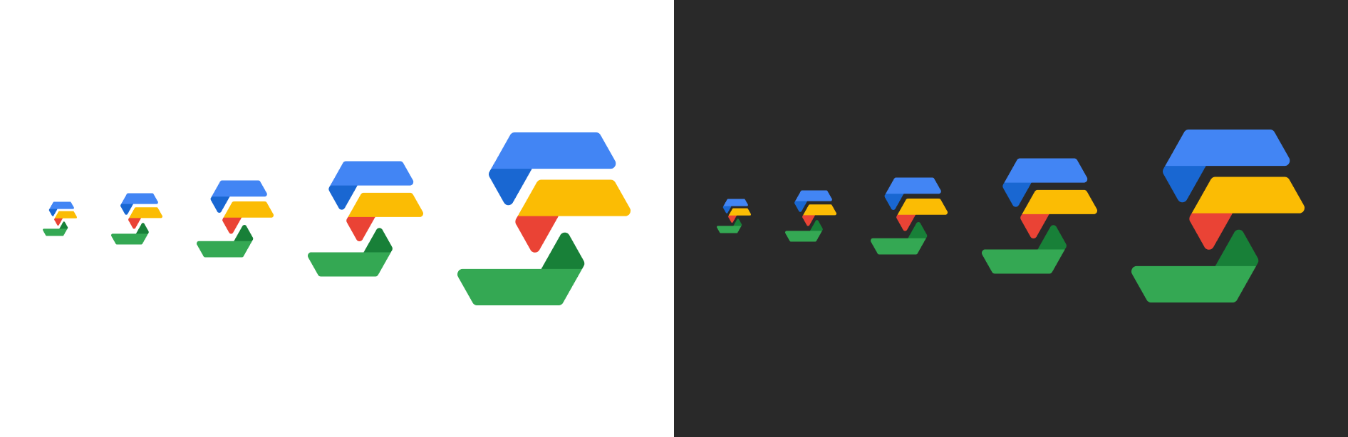
- Logo Design
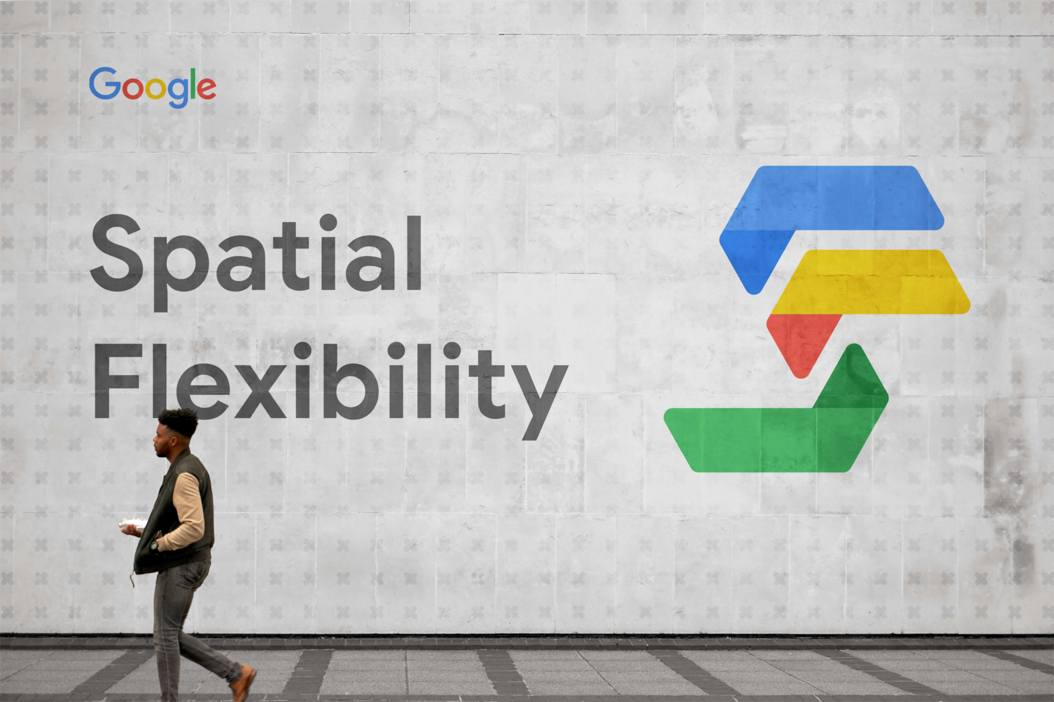
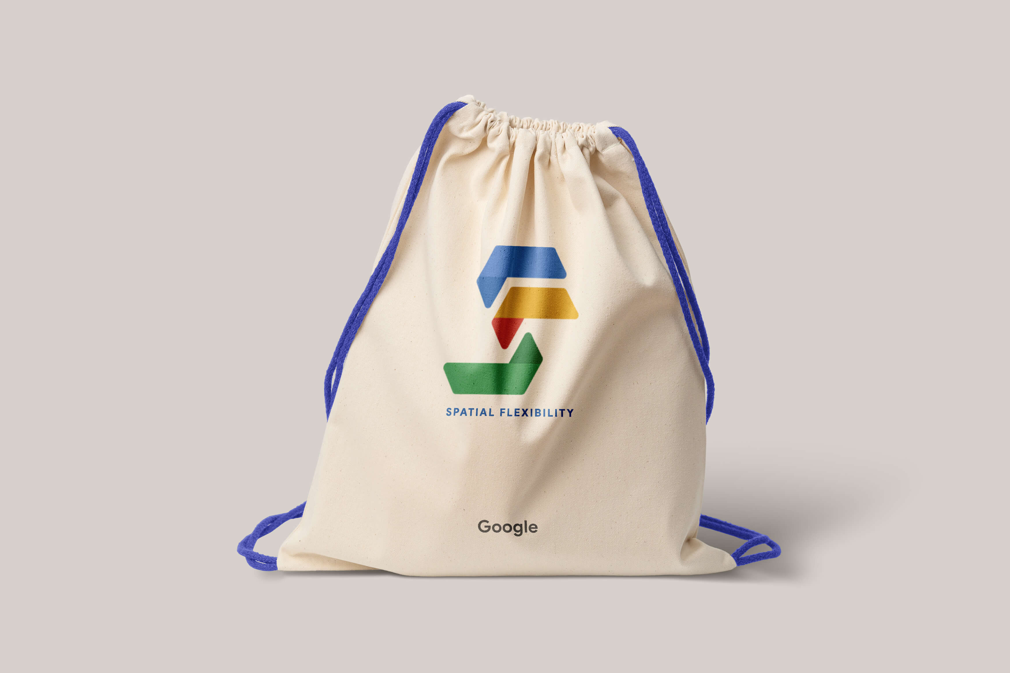
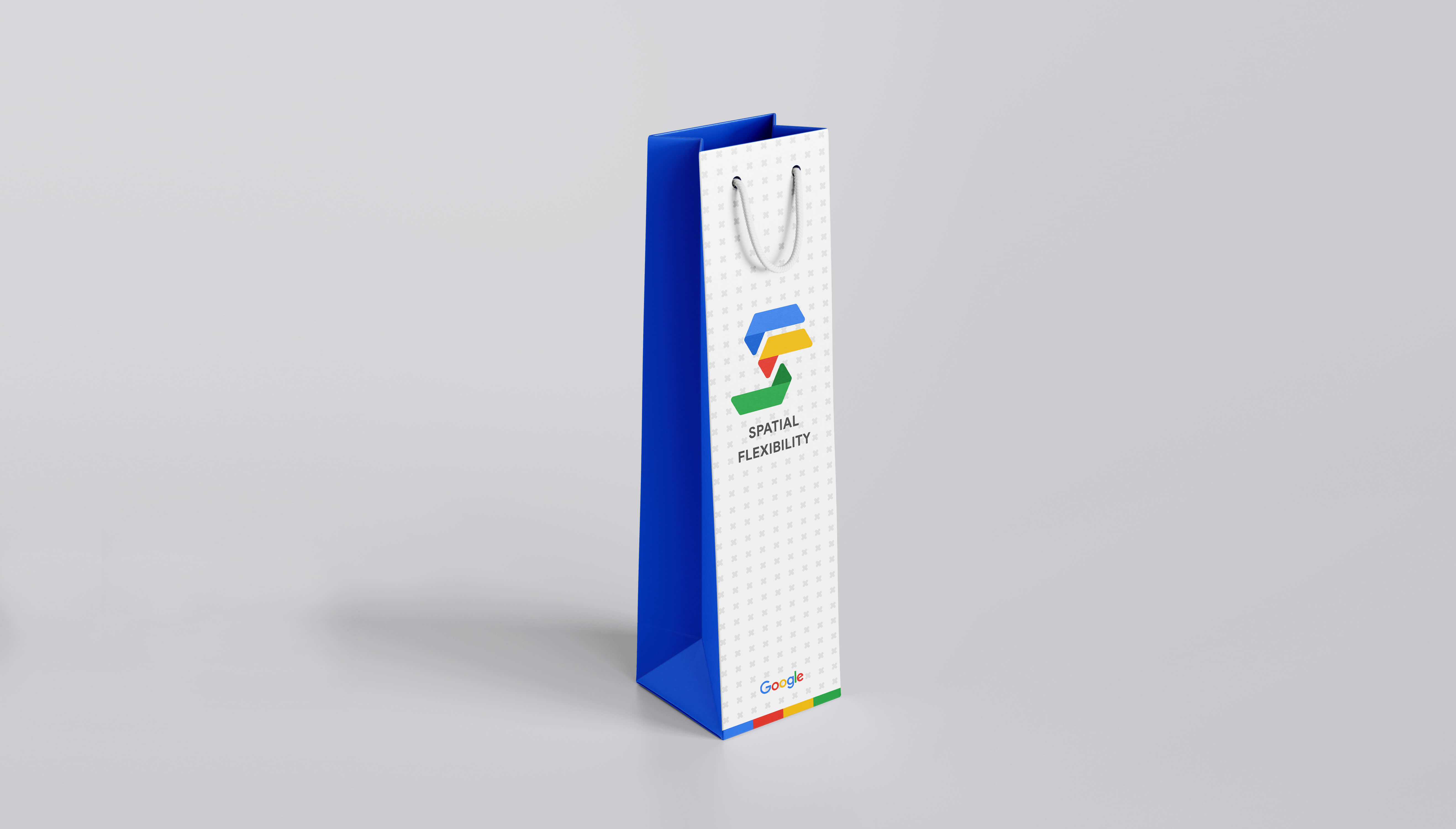
- Branding Design
- Design Mockups
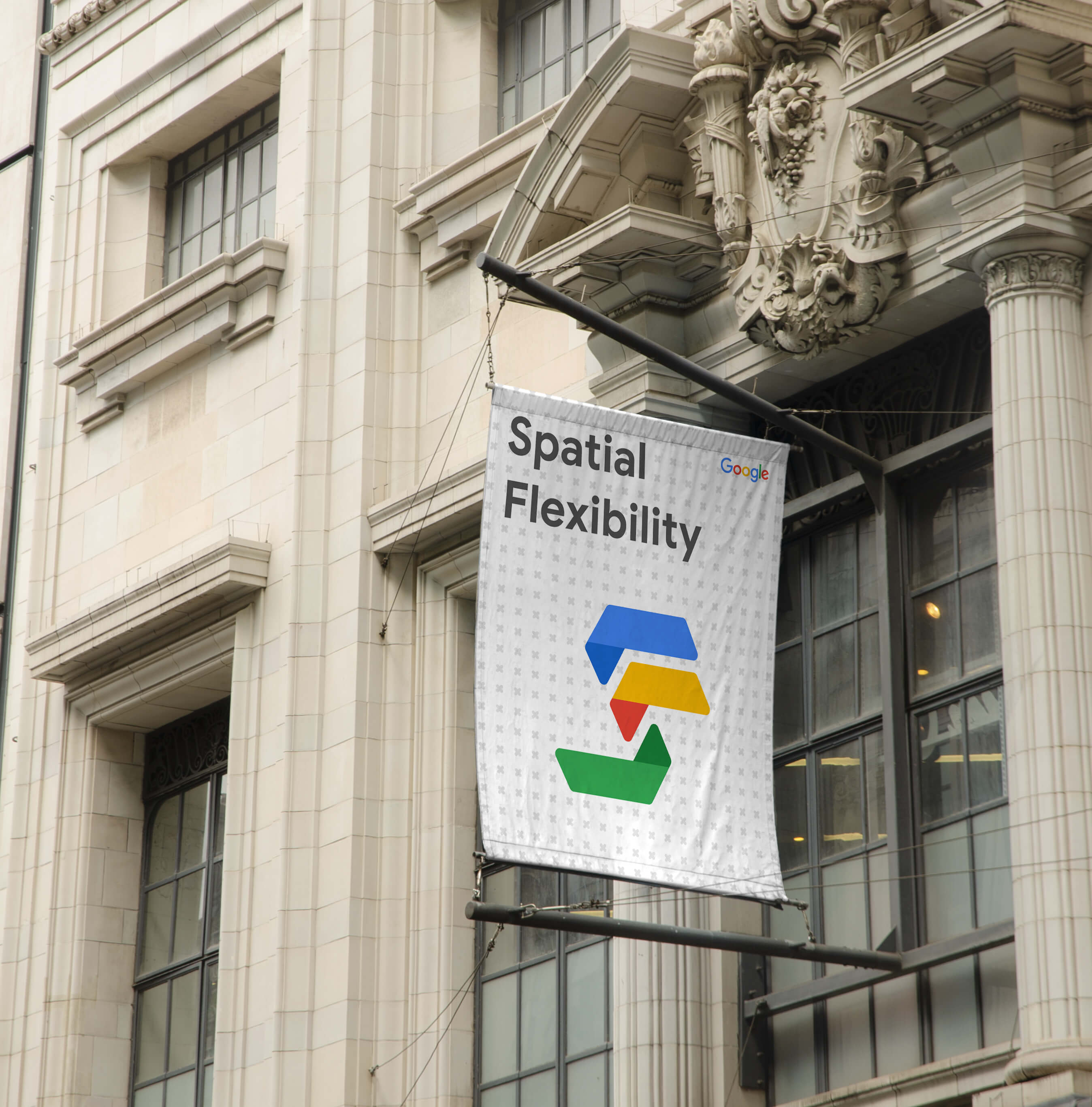
" The logo concept is inspired by the textual form of "SF" and embraces the simplicity, boldness, and aesthetic appeal outlined in Google's brand guidelines. Its adaptability enables effortless integration across diverse applications and sizes, ensuring a visually pleasing and cohesive design is consistently maintained. "
- Sushant Rai (Logo Designer)